Optica
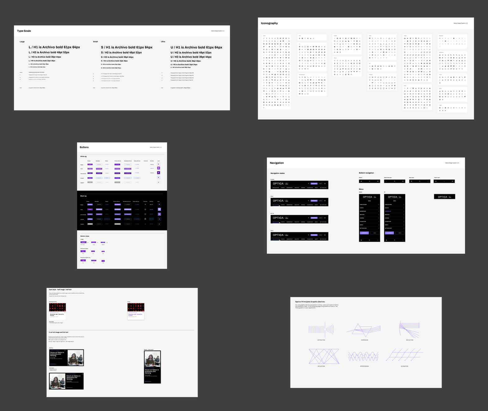
Prophet was tasked to take a 100 year old optical society into the present and future. Orginating in the United States and growing into a worldwide organization, OSA needed a system that could flex across their large variety of brands in both print and digital space.
After establishing their brand, I was the visual and UX designer redesigning their website, a blog in which their members can stay up to date on upcoming trade events, research, and other optics news.
I was tasked to create a design system robust enough to serve their number of use cases with continuity throughout desktop and mobile.
Visit the site HERE.
ROLE
Identity
Logo Design
Brand Strategy
Visual Design
Website Design
COLLABORATORS
Creative Director:
Craig Stout
Senior Designer:
Christina Bull
UX:
Ying Lee


